At my first tech job, I wanted to move laterally within the company from "Data Engineer" to "Software Engineer" (an internal position). I had to convince upper management I was qualified for the change. Given I had related work on my GitHub, I saw an opportunity to strengthen my argument by summarizing my GitHub content.
Relaying a breadth of experience with various technologies was my goal. The result is similar to that of a portfolio in that it puts my project work on display, but there is a key distinction in that this application was designed to supplement a live conversation with management as opposed to being something that could effectively standalone. Also distinct from a portfolio, this application makes the assumption that the viewer/user is invested in understanding quantity of work and experience moreso than quality, hence the application making little effort to highlight select projects.
Integral to my argument was conveying the quantity of experience with certain competencies, programming languages, frameworks, and tools. This application's key feature is being able to filter and search projects by keyword. Another key feature is an analytics breakdown on the type of content present on my GitHub. Content can be broken down by technology such that the projects relating to a particular technology are quantified. Content can also be broken down by "context", such that viewer/user could get insight into how much academic content was on display (for an audit of my education background) vs personal and professional projects.
This application uses the GitHub API to determine what content to render in real time, so no repository has to be managed in the application directly. Anything I do on GitHub is reflected in what's rendered in the app. Because of the app's real-time, dynamic, and automated nature, my GitHub as a whole needed to be formatted in a way that could be leveraged by the app. Most of my GitHub repositories are organized with a specific formula as to comply with this app's expectations.
Because this application expects a particular formula to the repositories of a given GitHub, it cannot be used to display content for other GitHub profiles (assuming other profiles don't adopt the same organization strategy). This also means this application cannot run locally, as a GitHub API key for a similarly organized GitHub profile would be needed to work properly.
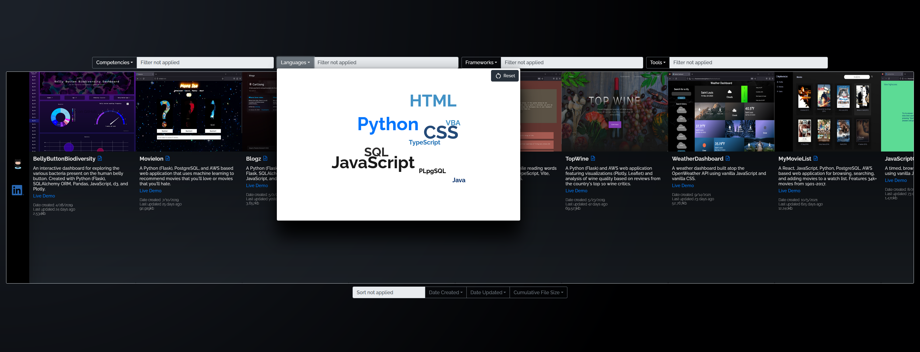
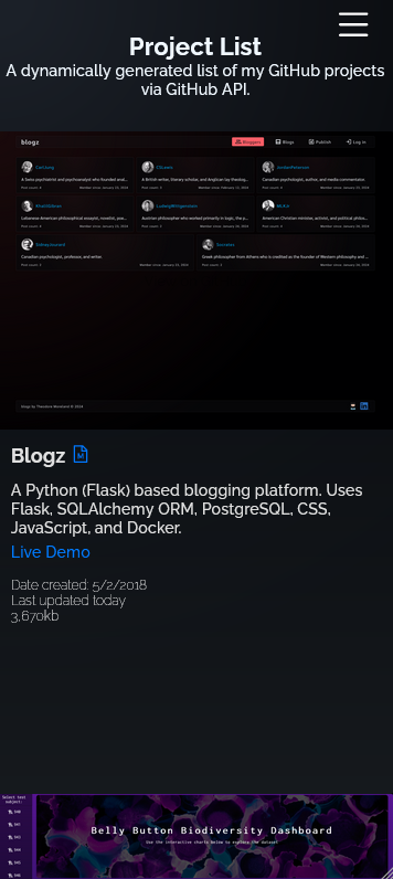
This application has undergone numerous design updates. See screenshots below.
- React
- TypeScript
- JavaScript
- HTML
- CSS
- Tanstack React Query
- MUI X Charts
- react-intersection-observer
- GitHub API
- AWS
- Vite
All previous versions arranged the projects horizontally. The horizontal alignment didn't turn out as I intended, the result was an unideal user experience. By version #3, I tried to compensate by syncing the user's vertical scroll to the app's horizontal scroll. This was ultimately not enough as said functionality wasn't intuitive to the user.
Previous versions also used word clouds as filter interfaces. While I still like the concept, this was difficult to implement in a mobile friendly way. Previous versions also featured a "View README" button for each project that would render the corresponding project README upon being clicked.
Version #3, in comparison to version #2, made some improvements to streamline the layout by improving layout symmetry and using less text. Version #3 also displayed names in the word clouds using their standard casing (e.g. JavaScript as opposed to Javascript etc...) and added a Reset button for the filter.
The mobile version didn't feature the word cloud filter interface, which made it feel inferior to the desktop version as the filtering interface was the app's core idea.


