


vue-active-swiper is a Mobile-oriented、No dependencies、Lightweight Swiper component for Vue
简体中文 | English
npm install vue-active-swiper --save
// require styles
import 'vue-active-swiper/dist/VueActiveSwiper.css'

import Vue from 'vue'
import VueActiveSwiper from 'vue-active-swiper'

Vue.use(VueActiveSwiper)// require styles
import 'vue-active-swiper/dist/VueActiveSwiper.css'
// in ES6 modules
import { Swiper, SwiperItem } from 'vue-active-swiper'
// in CommonJS
const { Swiper, SwiperItem } = require('vue-active-swiper')
export default {
components: {
Swiper,
SwiperItem
}
}<link rel="stylesheet" href="../node-modules/vue-active-swiper/dist/VueActiveSwiper.css" charset="utf-8">
<script src="../node-modules/vue-active-swiper/dist/VueActiveSwiper.umd.min.js"></script>const Swiper = VueActiveSwiper.Swiper
const SwiperItem = VueActiveSwiper.SwiperItem
new Vue({
el: '#app',
components: {
Swiper,
SwiperItem
}
})Work on a Vue instance:
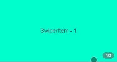
<Swiper>
  <SwiperItem>1</SwiperItem>
  <SwiperItem>2</SwiperItem>
  <SwiperItem>3</SwiperItem>
</Swiper>
or
<Swiper :urlList="[
  'https://dummyimage.com/375x100/FB8A80?text=1',
  'https://dummyimage.com/375x100/29A90F?text=2',
  'https://dummyimage.com/375x100/6F9DFF?text=3'
]" />| Option | Type | Description | Default | necessary |
|---|---|---|---|---|
| urlList | Array | image array If specified, subcomponents( SwiperItem) passed in by components will not work,Either urlList or SwiperItem,If both exist at the same time,urlList shall prevail |
null | false |
| backgroundSize | String | Specifies how the image is scaled in the sliding-container-box(Swiper),Value and Effect are the same as CSS background-size Valid only when urlList is specified |
cover | false |
| clientW | Number | Width of the sliding-container-box (Swiper) |
document.documentElement.clientWidth |
false |
| clientH | Number | Height of the sliding-container-box (`Swiper') | 200 | false |
| showCounter | Boolean | if need a default counter | false | false |
| counterStyle | Object | Customize the style of the default counter Valid only when showCounter is true |
null | false |
| startIndex | Number | Start swipe item index | 0 | false |
| criticalValue | Number | Proportional value of critical point When it exceeds the critical point represented by this value, it will automatically slide to the next picture. |
1/3 | false |
| autoPlayDelay | Number | If this parameter is specified and the value >= 0, the value will be taken as the time of automatic rotation delay(ms) for automatic rotation;Non-designated non-automatic rotation If you want to specify this value, it is generally recommended to set it to 3000 |
null | false |
| duration | Number | The time(ms) required to automatically scroll to a stable position |
350 | false |
| noDragWhenSingle | Boolean | If there is only one swipeItem, is dragging prohibited |
true | false |
| Event Name | Description | params |
|---|---|---|
| click | Click events for the component | activeIndex |
| change | Callback after each scroll | activeIndex |
The Swipercomponent provides a method goto, which allows users to specify slide to which Swiper Item:
this.$refs.mySwiper.goto(2)goto receives a Number parameter(index),eepresents sliding to a Swiper Item with index subscript
index start at 0
see more example - basic-slot
Swiper can also receive a named slot - extra,make it easier for developers to customize components more freely:
<Swiper>
  <SwiperItem>1</SwiperItem>
  <SwiperItem>2</SwiperItem>
  <SwiperItem>3</SwiperItem>
  <!-- named slot -->
  <p slot="extra">custom extra content</p>
</Swiper>MIT