
一个适用于几乎任意单选场景的单选组件。
支持优良的交互特效,以及像吃汉堡 🍔一样简单的多交互状态视图切换构建。你会爱上TA的 ❤。️
主理人:纽特(coorchice.cb@alibaba-inc.com)
English | 简体中文
感觉还不错?请投出您的 Star 吧 🥰 !
-
精彩的交互动效
-
支持对圆角精准控制
-
美妙的渐变效果支持
-
简单但有效的多状态视图构建支持
-
难以想象的灵活的可配置项
| 参数 | 类型 | 必要 | 默认值 | 说明 |
|---|---|---|---|---|
| value | <T> |
否 | null | [FRadio] 所代表的的值。当 [groupValue] == [value] 时,进入选中状态。 |
| groupValue | <T> |
否 | null | 单选组当前选中的值。当 [groupValue] == [value] 时,进入选中状态。 |
| onChanged | ValueChanged<T> |
否 | null | 当 [FRadio] 被变为选中时会回调 |
| enable | bool | 否 | true | 是否可用。不可用的 [FRadio] 将无法通过点击改变当前状态。通过 [disableNormal] 和 [disableSelected] 可以自定义不可用状态下的样式。 |
| toggleable | bool | 否 | false | 是否可以取消选中。 |
| width | double | 否 | 27 | 宽度。 |
| height | double | 否 | 27 | 高度 |
| normal | Widget | 否 | null | 未选中状态样式 |
| selected | Widget | 否 | null | 选中状态样式 |
| disableNormal | Widget | 否 | null | 未选中状态时的不可用样式 |
| disableSelected | Widget | 否 | null | 选中状态样式不可用样式 |
| hover | Widget | 否 | null | 鼠标进入时的样式 |
| focusNode | FocusNode | 否 | null | 焦点 |
| autofocus | bool | 否 | false | 是否允许自动获取焦点 |
| 参数 | 类型 | 必要 | 默认值 | 说明 |
|---|---|---|---|---|
| normalColor | Color | 否 | Color(0xffd9d9d9) |
未选中状态下的颜色 |
| selectedColor | Color | 否 | Color(0xff2593fc) |
选中状态下的颜色 |
| hasSpace | bool | 否 | true | 内部填充和边缘是否有间距。默认为 true。间距由 [FRadio] 提供黄金比例,开发者无需关心。 |
| border | double | 否 | null | 边框宽。默认由 [FRadio] 提供黄金比例,开发者无需关心。 |
| child | Widget | 否 | null | 未选中状态下的装饰组件,处于最上层级。 |
| selectedChild | Widget | 否 | null | 选中状态下的装饰组件,处于最上层级。 |
| hoverChild | Widget | 否 | null | 鼠标悬停时的装饰组件,处于最上层级。 |
| gradient | Gradient | 否 | null | 该属性允许配置选中状态下的渐变效果,会覆盖 [selectedColor] 。 |
| duration | Duration | 否 | Duration(milliseconds: 150) |
状态切换动画时长。 |
| fill | bool | 否 | true | 选中时,是否允许内部填充。 |
| corner | FRadioCorner | 否 | 圆形 | 边角。 |
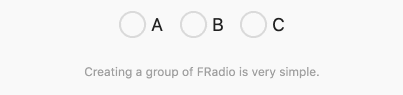
FRadio(
  value: 1,
  groupValue: groupValue_1,
  onChanged: (value) {
    setState(() {
      groupValue_1 = value;
    });
  },
),

FRadio(
  value: 2,
  groupValue: groupValue_1,
  onChanged: (value) {
    setState(() {
      groupValue_1 = value;
    });
  },
)
一个常规的 FRadio 构建起来十分简单。你仅需配置:
value:它会标示当前 FRadio 所代表的值。
groupValue:表示当前单选组的选中值。
onChanged:当选中时,会回调。你需要在这个回调中,将 FRadio 的值 value 赋给单选组 groupValue,以完成组的选项切换。
💡值得注意的是,只有当
groupValue==value的时候,FRadio 才会进入选中状态。这很灵活,也就是说,你只需要通过改变groupValue就可以随意的切换选项。
FRadio(
value: 1,
groupValue: groupValue_2,
onChanged: (value) {
setState(() {
groupValue_2 = value;
});
},
toggleable: true,
enable: enable_1,
selectedColor: Color(0xffffc900),
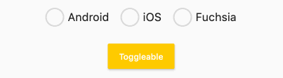
),通过 enable 属性,可以控制 FRadio 的可用性。当 FRadio 不可用时,会展示不可用的样式。他们当然包括 选中、未选中 两种。
通过默认构造函数构建出来的 FRadio 的不可用样式是变灰。
如果你想要构建不一样的不可用样式,可以通过 FRadio.custom() 构造函数,配置 disableNormal (未选中不可用样式) 和 disableSelected (选中不可用样式)即可。
FRadio 将允许用户取消选择,通过配置 toggleable: true 就能实现。当然,默认情况下,我们不开放这一功能。
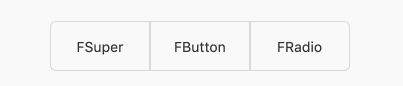
FRadio(
  width: 100,
  height: 50,
  value: 1,
  groupValue: groupValue_3,
  onChanged: (value) {
    setState(() {
      groupValue_3 = value;
    });
  },
  selectedColor: Color(0xffffc900),
  corner: FRadioCorner(leftTopCorner: 6, leftBottomCorner: 6),
  border: 1,
  hasSpace: false,
  selectedChild:
      Text("FSuper", style: TextStyle(color: Color(0xff333333))),
  child: Text("FSuper", style: TextStyle(color: Color(0xff333333))),
)
在这个栗子 🌰 中,FRadio 展示出了几个对于单选组件来说不可以的能力。
通过 corner 属性,你可以准确的控制边角,让 FRadio 不再是一个圆形。
hasSpace 让你能够自由的选择是否需要保持内部填充和边缘的距离,就像默认情况下那样。
通常,FRadio 在内部具备一套精美的计算方法,以提供极具美感的视图。在默认情况下,FRadio 会自动计算边框的宽度,以保持协调的美感。
但你仍然可以通过 border 属性来按需配置。

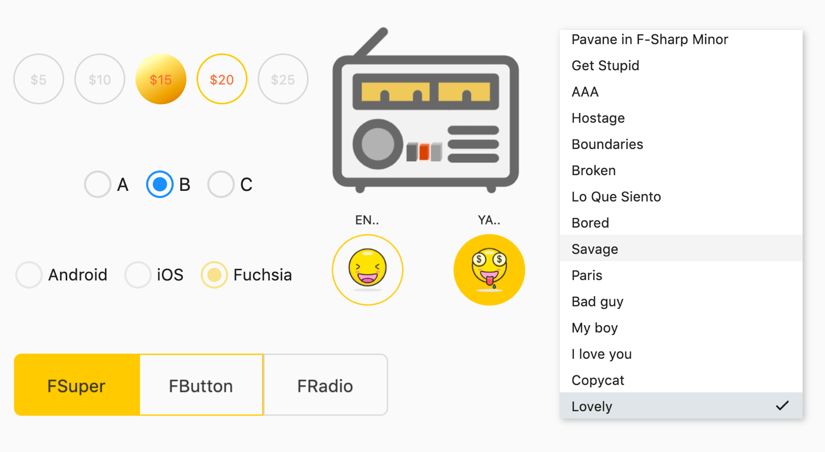
FRadio(
  width: 50,
  height: 50,
  value: index + 1,
  groupValue: groupValue_4,
  onChanged: (value) {
    setState(() {
      groupValue_4 = value;
    });
  },
  gradient: LinearGradient(
    colors: [
      Color(0xffFEFDBB),
      Color(0xffFFE16C),
      Color(0xffEA9D1C),
      Color(0xffD46307),
    ],
    begin: Alignment(-0.1, -0.9),
    end: Alignment(1.0, 1.0),
    stops: [0.0, 0.2, 0.7, 1.0],
  ),
  selectedColor: Color(0xffffc900),
  hasSpace: false,
  border: 1.5,
  child: Text(
    "\$${5 * (index + 1)}",
    style: TextStyle(color: Color(0xffd9d9d9), fontSize: 13),
  ),
  hoverChild: Text(
    "\$${5 * (index + 1)}",
    style:
        TextStyle(color: Colors.deepOrangeAccent, fontSize: 13),
  ),
  selectedChild: Text("\$${5 * (index + 1)}",
      style: TextStyle(
          color: Colors.deepOrangeAccent, fontSize: 13)),
)
你看,这就是渐变的妙用。
gradient 接受多种类型的渐变配置。如果你打算让单选视图看起来更多彩或者更具空间感的话,可以试试它。
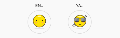
FRadio(
  width: 80,
  height: 80,
  value: 1,
  groupValue: groupValue_5,
  onChanged: (value) {
    setState(() {
      groupValue_5 = value;
    });
  },
  child: Image.asset("assets/emoji_0.png", width: 50),
  hoverChild: Image.asset("assets/emoji_1.png", width: 50),
  selectedChild: Image.asset("assets/emoji_2.png", width: 50),
  hasSpace: false,
  toggleable: true,
  selectedColor: Color(0xffffc900),
  border: 1.5,
)
FRadio 能够神奇的让整个单选变得不再索然无味!
child 和 selectedChild 配置了浮于最上层的装饰组件。
鼠标悬停效果是如何构建的呢?
边框颜色会在悬停时自动接受 selectedColor 所配置的选中状态颜色。而装饰,可以通过 hoverChild 来进行配置。
在没有配置 hoverChild 的情况下,会接受 selectedChild 所配置的选中状态装饰。
怎么样?这太有趣了吧!

如果默认构造函数不能满足你,你还需要些什么?
对了,自~定~义!
通过 FRadio.custom() 构造函数,你可以分别通过:normal、selected、disableNormal、disableSelected、hover 来为 FRadio 配置不同交互状态下样式。
这将会解开你手上的麻绳,你自由了,然后可以开始随意创作了。
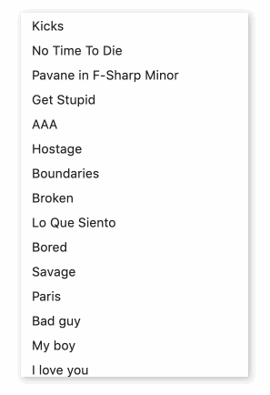
ListView.builder(
  itemCount: list.length,
  itemBuilder: (context, index) {
    return FRadio.custom(
      value: index,
      groupValue: groupValue_7,
      onChanged: (value) {
        setState(() {
          groupValue_7 = value;
        });
      },
      normal: Container(
        width: 250,
        height: 100,
        color: Colors.white,
        padding: EdgeInsets.only(left: 12, right: 12),
        child: text(index),
      ),
      hover: Container(
        width: 250,
        height: 100,
        color: Color(0xff212121).withOpacity(0.05),
        padding: EdgeInsets.only(left: 12, right: 12),
        child: text(index),
      ),
      selected: Container(
        padding: EdgeInsets.only(left: 12, right: 12),
        color: Color(0xff607D8B).withOpacity(0.2),
        child: Row(
          crossAxisAlignment: CrossAxisAlignment.center,
          mainAxisAlignment: MainAxisAlignment.spaceBetween,
          children: [
            Text("${list[index]}"),
            Icon(
              Icons.check,
              size: 18,
            ),
          ],
        ),
      ),
    );
  },
)
现在你是自由的,所以不要吝啬创意。
FRadio 可不仅仅是个圆形的小按钮,它是能解决几乎所有单选问题的。
在项目 pubspec.yaml 文件中添加依赖:
dependencies:
  fradio: ^<版本号>
⚠️ 注意,请到 pub 获取 fradio 最新版本号
dependencies:
  fradio:
    git:
      url: 'git@github.com:Fliggy-Mobile/fradio.git'
      ref: '<分支号 或 tag>'
⚠️ 注意,分支号 或 tag 请以 fradio 官方项目为准。
Copyright 2020-present Fliggy Android Team <alitrip_android@list.alibaba-inc.com>.

Licensed under the Apache License, Version 2.0 (the "License");
you may not use this file except in compliance with the License.
You may obtain a copy of the License at following link.

    http://www.apache.org/licenses/LICENSE-2.0

Unless required by applicable law or agreed to in writing, software
distributed under the License is distributed on an "AS IS" BASIS,
WITHOUT WARRANTIES OR CONDITIONS OF ANY KIND, either express or implied.
See the License for the specific language governing permissions and
limitations under the License.
感觉还不错?请投出您的 Star 吧 🥰 !
--
-
clone 工程到本地
-
进入工程
example目录,运行以下命令
flutter create .
- 运行
example中的 Demo